This option can be accessed from the Data Analysis option on IFs Main Menu.
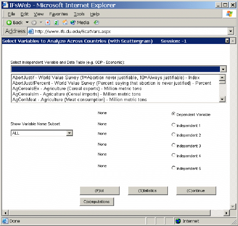
The Main Menu of Analyze Across Countries is dominated by the Select Variable and Data Table, the table located at the top of the picture above. From this list, users are able to select from all of the data tables that underlie the functioning of IFs. Users must pick a dependent variable and they have the ability to choose as many as five independent variables.
Note that the Select Variable and Data Table list box includes many variables that do not exist, or do not have the same names as variables used in the model. These are from the data base. When possible, data were gathered for many historic years, in order to provide the ability to analyze across time (longitudinal analysis, described later) as well as across countries at a given point in time (cross-sectional analysis). When users select a variable name for which data from more than one year is available, you will be asked to specify a year.
To create a cross-sectional analysis, specify a dependent variable (a variable you want to understand the causes of) and one or more independent variables (possible causes). For instance, pick life expectancy (LifExp – SocioPolitical (Life expectancy at birth) - years) as the dependent variable. To do this, type LifExp into the box and then left-click on the variable name. You will be asked whether you would like to choose “Select” or “Data Information”. For this example, choose “Select”. You will then be asked to choose a year. For this example, choose the year 2000. Notice that LifExp is shown as your Dependent Variable.
Now you will want to choose an independent variable. First, make sure the toggle next to Independent 1 is selected. Many relationships in IFs treat Gross Domestic Product (GDP) per capita at purchasing power parity as an independent variable (GDP2000PCPPP – Economic (GDP per capita (PPP)) – 2000 PPP$). Click GDP2000PCPPP in the Select Variable list box. You will then have to choose a year. For this example, choose the year 2000. Notice that GDP2000PCPPP(2000) is then shown as the Independent 1.
Now touch the Plot button to create a scatter plot showing the relationship between the two selected variables for as many countries as exist in the data set. You will see that life expectancy increases rapidly as GDP per capita rises. The scatter plot may be sufficient for many users of IFs. You can print the scatter plot or save it for other analysis or for use in other applications.
Some users, however, will want to proceed further and to describe the relationship between the two variables with an equation. If you have Microsoft Excel available on your computer, you can do this by touching the Excel button from the Scatter plot. That button actually creates a link with Excel and carries the scatter plot (with supporting data) to Excel for further analysis.
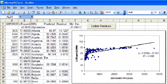
Excel opens up many additional features for your use that can be described in more detail using Excel’s Help menu. But let’s walk through the process of fitting a line and associated equation to the data (important for the next Lesson). First, maximize the Excel screen by using the maximize button in the upper right hand corner of the window (the icon of a single large window).
Then click anywhere on the graph to activate it. That allows you then to right-click on various components of the graph in order to edit those components. For example, right-click on the straight line that Excel has fit to the data. You will see a small pop-up menu with a couple of options. Select the Format Trendline option and you will see the following window.
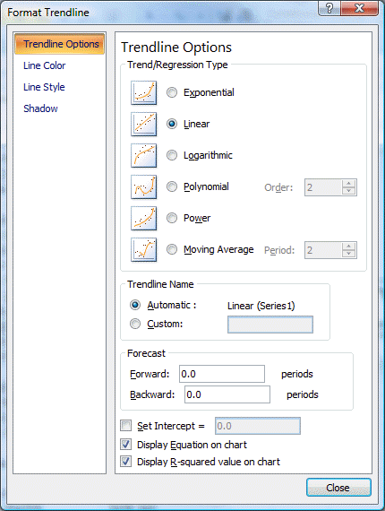
Choose the Type tab and select the logarithmic trend/regression type for a better fit.
Then choose the Options tab for additional choices including checking boxes for "Display Equation on Chart" and "Display R-Squared Value on Chart." Although both options are checked, the equation and R-Squared are sometimes not initially visible on the chart because they are not placed properly when you open Excel (it depends on the variables you plot). If they are not visible, turn the options both off, close the Format Trendline window, right-click on the line, select again the Format Trendline option, and again select the Options folder. Turn the Display Equation and Display R-Squared options back on and exit from the Format Trendline window again. You should now see the equation and r-squared someplace on the graph and can drag them to a better location, nearer the intersection of the two axis.
If you now right-click on the dependent or y-axis, you will see a small pop-up menu with several options. Choose the format axis option and the following window will appear:
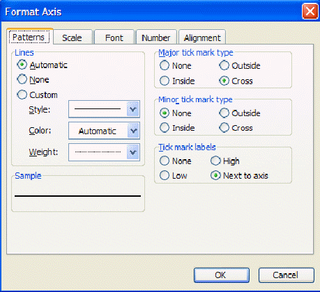
Under the Scale tab you will find maximum value, minimum value, and other settings. Often you will find it very useful to reset maximum or minimum values. Try, for example, setting the minimum on the y-axis to 0 and the maximum to 100.
There is much more that you can do with Excel, including copying the figure you have just created and incorporating it into a word processing file. Experiment.
Exit from Excel (no need to save the file unless you want to), and click on Continue to move from the Scatterplot back to the Select Variables to Analyze Across Countries window (reproduced near the top of this lesson).
Although the introduction of a control variable works helps in looking at relationships involving up to three variables (dependent, independent, and control), it is possible to examine relationships involving as many as five independent variables (see again the IFs window shown earlier on analyzing variables across countries). The key to this is selection of the Statistics option that you can see at the bottom of that window (next to the Plot button). After selecting a dependent variable and as many as 5 independent variables, touch the Statistics button. That will display the set of transformation options.
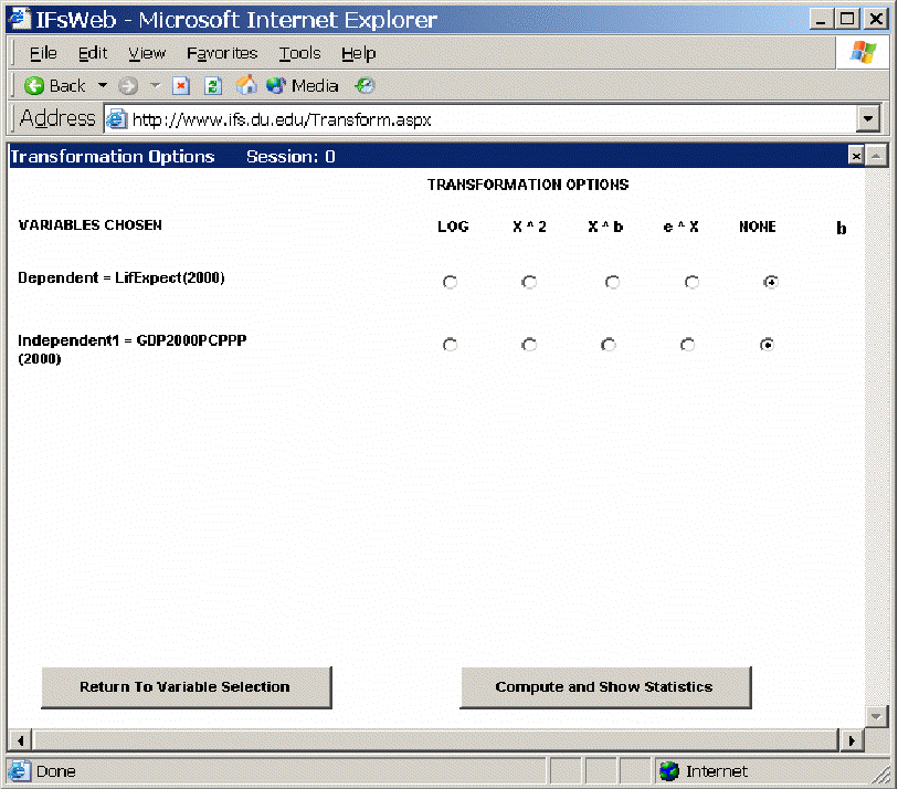
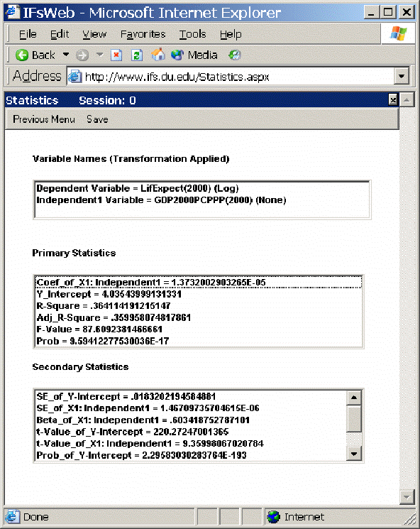
The transformation options allow you to apply transformations to your dependent and/or independent variables, just as you saw earlier in Excel that a logarithmic transformation of GDP per capita helped explain life expectancy better. Choose here again the logarithmic transformation of GDP per capita and then select the button Compute and Show Statistics. That will produce the following window showing statistics about the relationships among these three variables. These statistics will not be explained here – please see a standard statistics textbook.
Computations: Click on the sub-option for Computations to obtain the following window.
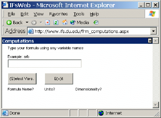
In order to create a computation to further analyze the relationship between a number of variables, simply enter a formula that you would like to use using traditional symbols (+, -, *, /, etc.) After you have entered your formula, click on Select Vars. This will open a new web page that will ask you to provide a formula name, dimensions name and units name. After you have finished with this function, click Ok.
This will bring a new window where you can select the variables you would like to use. Click on the CodeVar that you would like to assign a variable. This will bring up a screen similar to the main menu of the Cross-Sectional Analysis window. From this menu, type in the variable you would like to select from the list. Hit Enter to select this variable. You will then be prompted to select a year. Choose your year and press enter. After you have selected the year you will be returned to the Computations menu to select a variable for your other CodeVar. You will notice that the first variable you selected is now attached to the CodeVar you wanted. After you are finished, click Exit to return to the Cross-Sectional Analysis menu in order to see your Computation displayed. It will be labeled on the main menu.