This general topic will go over the possibilities available to users when they access a graph.
There are four main graphs available on IFs. These are Line Graphs, Bar Graphs, Pie Charts and Scatter Plots. Depending on whether you are accessing graphs to display historic data or forecast data, different options will be available.
Below is a general Line-Graph presented by IFs:
The display options at the top of the chart are typical for most graphs.
The Continue button: Use this to exit out of the graph and return to the previous screen.
The Save Option: This will save the image you have created as one of a variety of files. The image can also be exported to the clipboard for pasting in other applications. This option also allows users to specify the size of the file that they will be creating.
The Print option: Select this option, choose what printer you will send the file to and then OK.
The Common/Scaled toggle: The scaled option displays a traditional graph. The common function displays the data points as moving from zero to one, typically the top left or bottom right, and then moving towards the opposite corner of the graph. This option is useful for those who are displaying data that either vary greatly and thus trends and patterns can not be easily distinguished.
The Display Format Option: This allows users to change the names in the legends, the titles of the graphs and generally customize the image for export.
There may be other options on the top of your graph. Some displays, like Pie Charts, have an Advance and Regress option at the top of the Main Menu. These options will allow users to move their pie chart through time in 5 year intervals.
By double-clicking on the body of the graph, users are presented with a number of other display options. Users can change labels, colors, styles and much more through this option. This new window that is displayed by double-clicking on the body of the graph has its own help system that can be accessed by clicking on the Help button located at the bottom of the window.
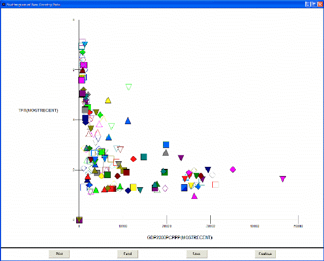
Scatter Plots have different options that are located at the bottom of the plot. Below is an image taken from IFs of a scatter plot:
The print option is similar to the print option discussed above.
The Excel option allows users to export the data and the chart into Excel for further manipulation.
The Save option allows users to save their image.
The Continue option allows users to exit.
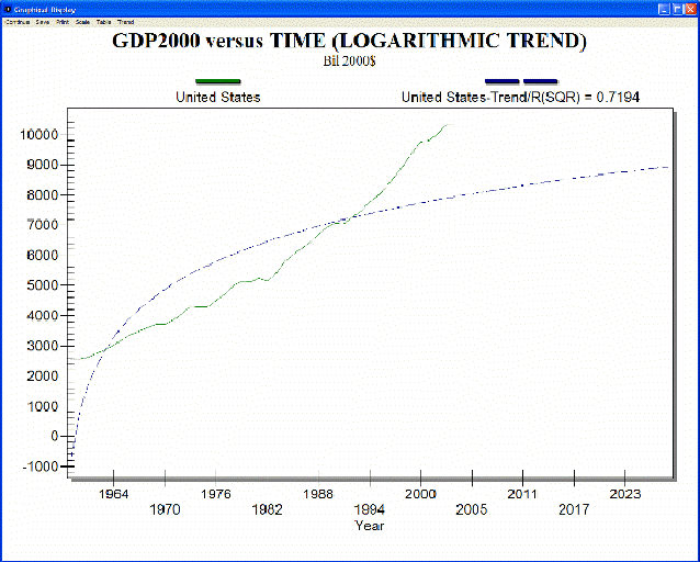
If you have accessed historic data and are taking a longitudinal analysis (found by selecting Data Analysis from the Main Menu and Analyze Across Time), there is the ability to extrapolate historic trends into the future.
By selecting the Trend option from the Main Menu of this feature, users are able to fit Linear, Polynomial, Logarithmic, Exponential or S-Shaped curves to historic data sets. One example is displayed below: